TL;DR
Master professional composition in AI image generation with 42 proven techniques used by cinematographers and photographers. Each technique includes exact prompts for Atlabs AI, covering framing, geometry, perspective, lighting, color theory, and storytelling. Transform basic AI images into cinematic masterpieces.
Start Creating on Atlabs AI – Free Trial Available
Why Composition Is the Secret to Professional AI Images
Creating professional, cinematic images with AI isn't just about describing what is in the scene, it's about describing how the scene is viewed. The secret sauce is composition.
Most AI users write prompts like "a city at night" or "a portrait of a woman." The results? Generic, forgettable images that look like every other AI-generated visual.
The difference between amateur and professional AI images is composition.
In this definitive guide, you'll learn 42 composition techniques used by professional photographers and cinematographers, complete with exact AI prompts optimized for Atlabs AI. Whether you're generating storyboards, marketing assets, concept art, or digital masterpieces, these prompts will help you direct AI like a pro.
What You'll Learn
✓ 42 professional composition techniques with copy-paste prompts
✓ How to use the Golden Ratio, Rule of Thirds, and Fibonacci spirals in AI
✓ Lighting techniques from Chiaroscuro to High/Low Key photography
✓ Color theory for emotional impact (complementary, analogous, triadic)
✓ Perspective tricks that change psychological impact
✓ Storytelling through visual arrangement
How to Use This Guide
Each technique follows this format:
The Technique: What it is and when to use it
The Prompt: Exact copy-paste text for Atlabs AI
Best For: Recommended use cases
Pro Tip: Combine multiple techniques in a single prompt (e.g., "Rule of thirds + complementary colors + leading lines") for even more cinematic results.
Chapter 1: Framing Techniques
How you place your subject within the canvas defines the balance of the image.
Quick Reference: Framing Techniques
Technique | Effect | Best For |
|---|---|---|
Golden Ratio | Natural, aesthetic balance | Landscapes, portraits, nature |
Rule of Thirds | Professional, balanced | General photography, marketing |
Symmetry | Order, perfection | Architecture, Wes Anderson style |
Negative Space | Isolation, minimalism | Product photography, artistic shots |
Fill the Frame | Intensity, detail | Macro, wildlife, dramatic portraits |
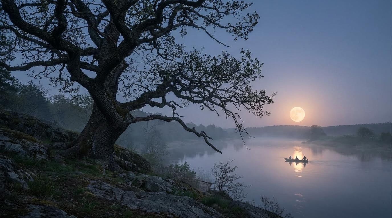
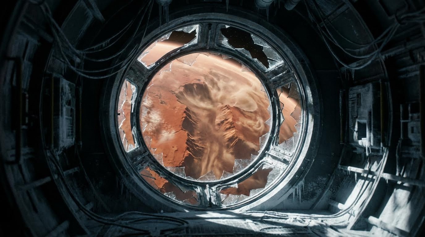
1. Golden Ratio (Fibonacci Spiral)
What is the Golden Ratio in photography?
A mathematical spiral found in nature (1.618:1) that leads the eye naturally to the subject. Used by Renaissance masters and modern cinematographers alike.
The Prompt:
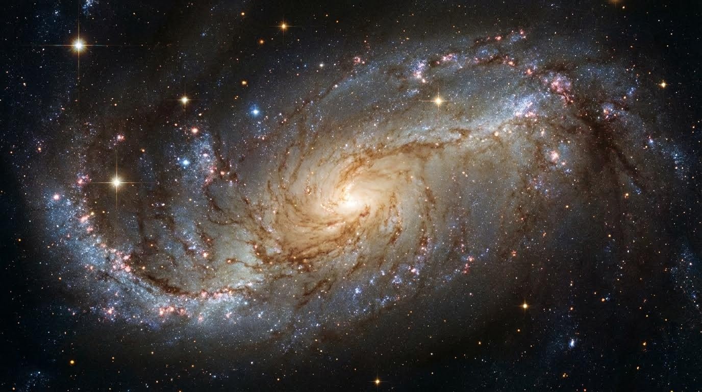
Best For: Landscapes, nature photography, astronomical scenes, organic compositions
Why It Works: The human eye naturally follows spiral patterns, creating an instinctive sense of beauty and harmony.
2. Rule of Thirds
How do I use the Rule of Thirds in AI images?
Divide the image into a 3×3 grid and place the subject at an intersection point. This creates natural balance and guides the viewer's eye.
The Prompt:
Best For: Portraits, landscapes, product photography, social media content
Pro Tip: Place horizon lines on the upper or lower third line, never in the center.
3. Symmetry
When should I use symmetrical composition?
A perfectly mirror-imaged scene conveys order, perfection, or holiness. Famous in Wes Anderson films and architectural photography.
The Prompt:
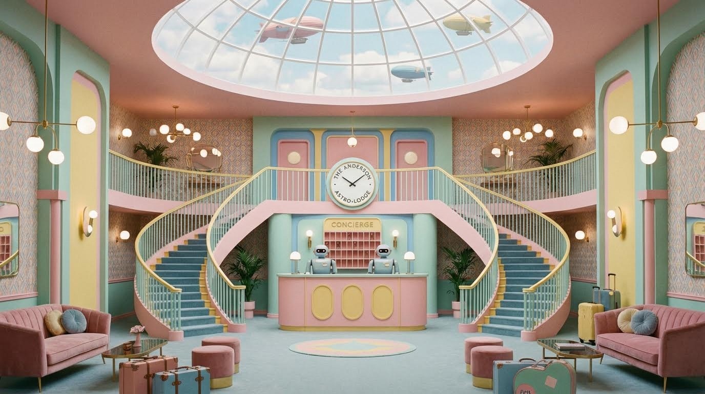
Best For: Architecture, luxury brands, formal portraits, spiritual imagery
Examples: Grand Budapest Hotel, Kubrick films, luxury hotel lobbies
4. Asymmetry
How do I balance an asymmetrical composition?
Balance a large subject on one side with a smaller element on the other for a natural, dynamic feel.
The Prompt:
Best For: Natural scenes, candid photography, editorial content
Why It Works: Asymmetry feels more organic and less staged than perfect symmetry.
5. Rule of Odds
Why are odd numbers more pleasing in composition?
Using an odd number of subjects (3, 5, 7) creates a more dynamic and visually pleasing arrangement than even numbers.
The Prompt:

Best For: Product photography, still life, group portraits, food photography
Psychology: Odd numbers prevent the eye from pairing objects, keeping the image dynamic.
6. Fill the Frame
When should I fill the entire frame with my subject?
Get close enough that the subject takes up the entire image, removing all distractions. Creates intimacy and intensity.
The Prompt:
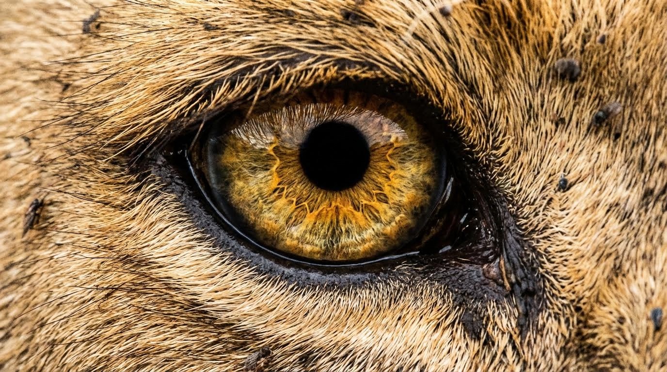
Best For: Wildlife photography, macro shots, emotional portraits, texture studies
Impact: Forces viewer to confront the subject directly with no escape.
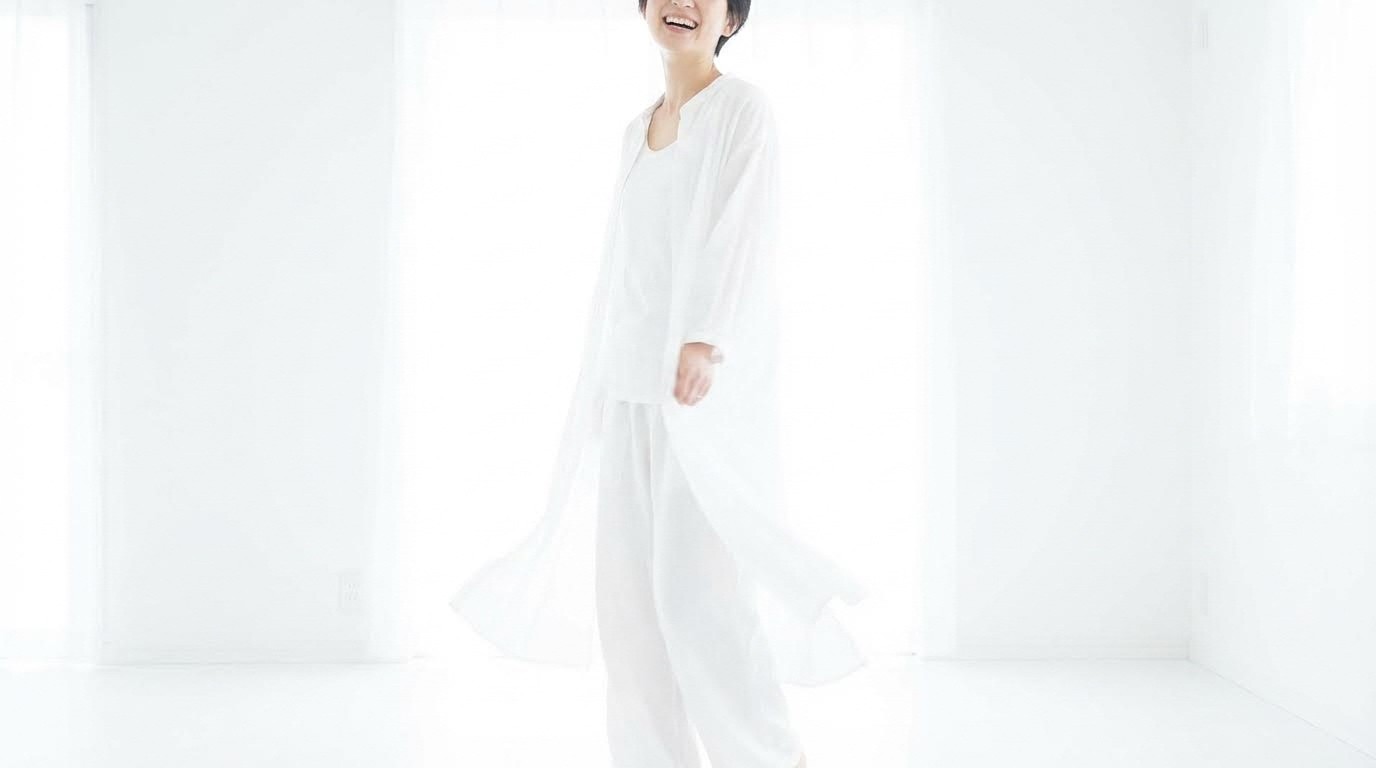
7. Negative Space
How do I use negative space effectively?
Leave large empty areas (sky, wall, fog) to emphasize isolation, scale, or minimalism.
The Prompt:
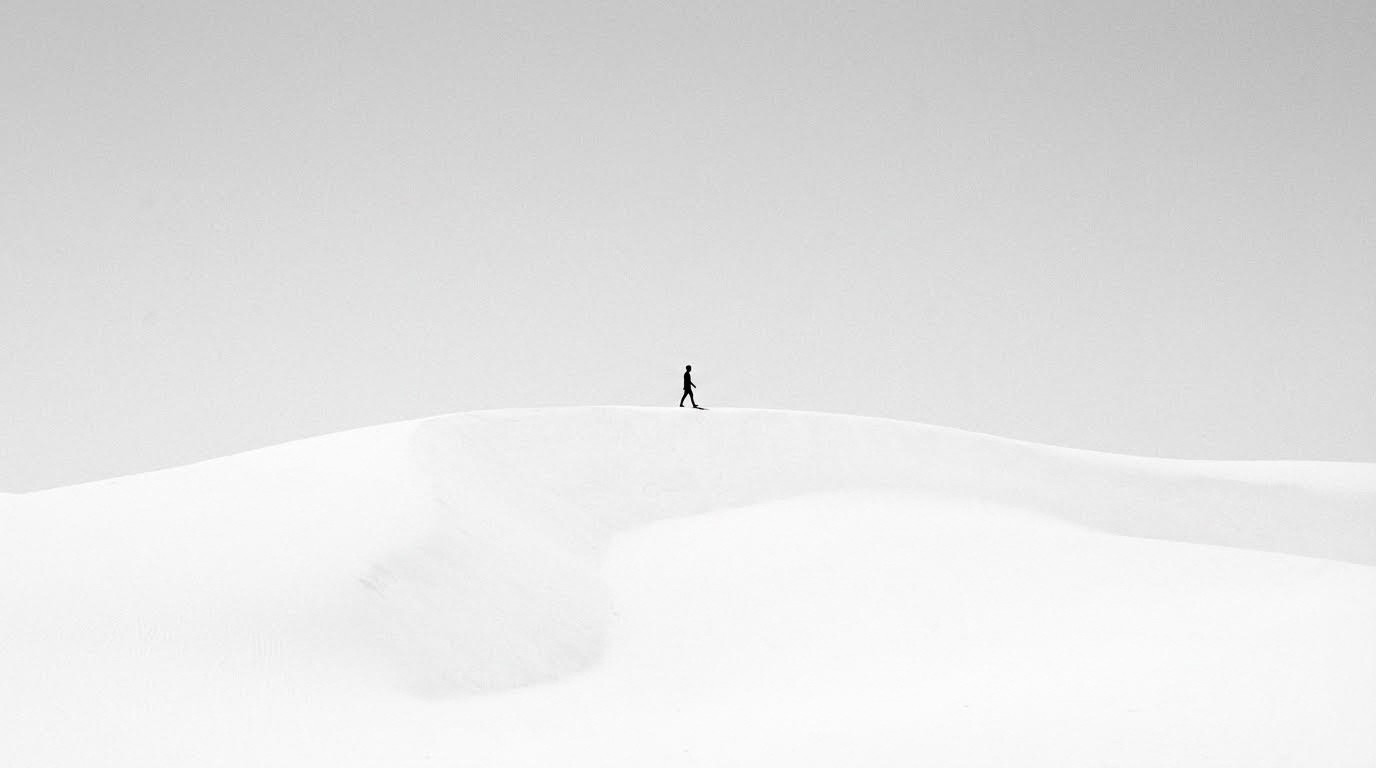
Best For: Minimalist art, Apple-style product photography, loneliness themes, scale emphasis
Design Principle: "White space" in design, lets the subject breathe.
8. Rule of Space
What is the Rule of Space in cinematography?
Leave "breathing room" in the direction the subject is looking or moving. Creates anticipation and context.
The Prompt:
Best For: Portraits, action shots, automotive photography, movement
Common Mistake: Placing subjects looking into the edge of the frame creates claustrophobia.
9. Framing Within the Frame
How do I create depth with natural frames?
Use environmental elements (windows, trees, arches, doorways) to create a border around the subject.
The Prompt:
Best For: Architectural photography, storytelling, voyeuristic perspectives, depth creation
Examples: Looking through doorways, windows, archways, foliage
10. Golden Triangle
What is the Golden Triangle composition technique?
Align elements along diagonal lines connecting opposite corners to create dynamic tension and energy.
The Prompt:
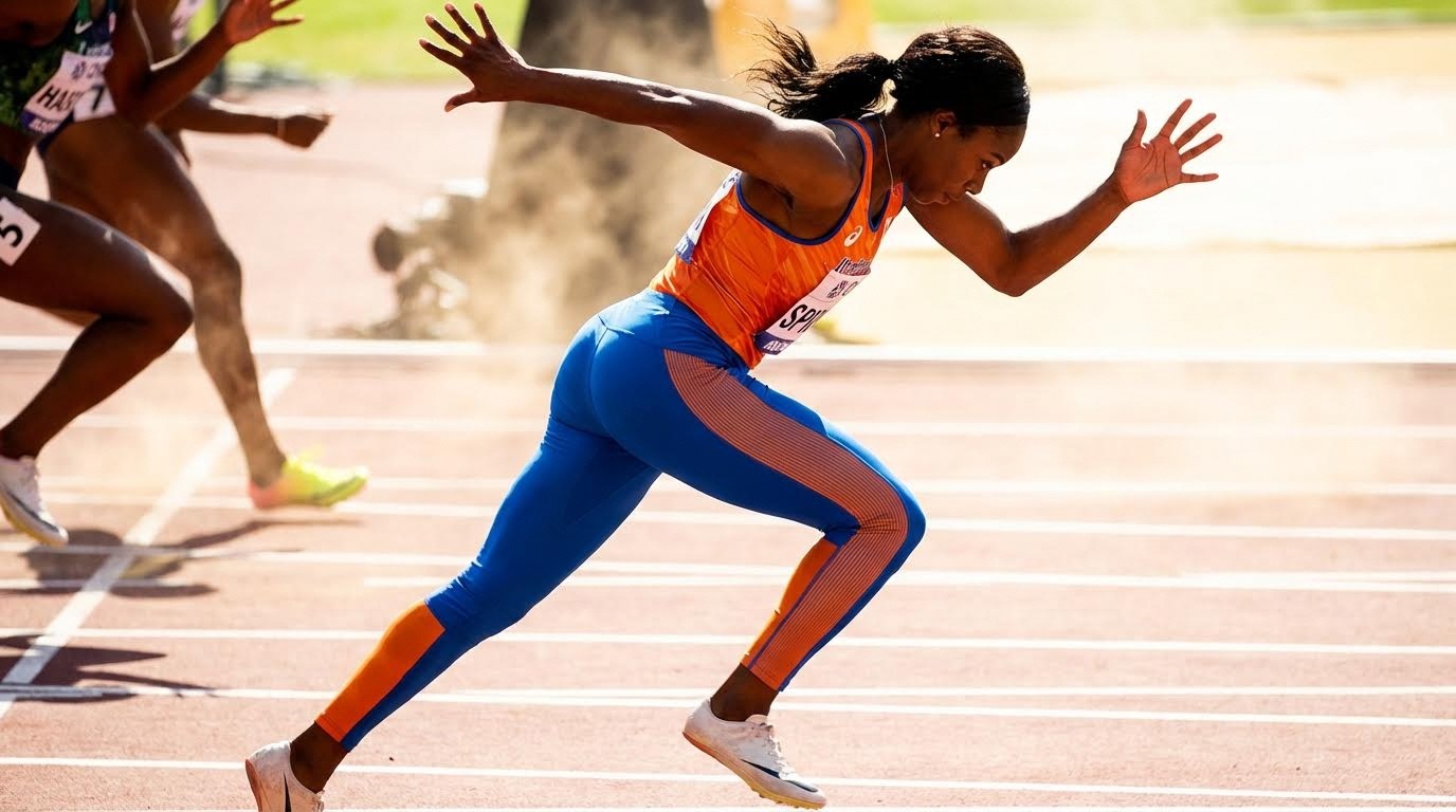
Best For: Sports photography, action scenes, dynamic portraits, movement
Technical: Draw a diagonal from corner to corner, then perpendicular lines from remaining corners.
11. Center Eye Dominance
When should I center the subject's eye?
Place the dominant eye of a subject exactly in the center of the frame for intense, direct connection with the viewer.
The Prompt:
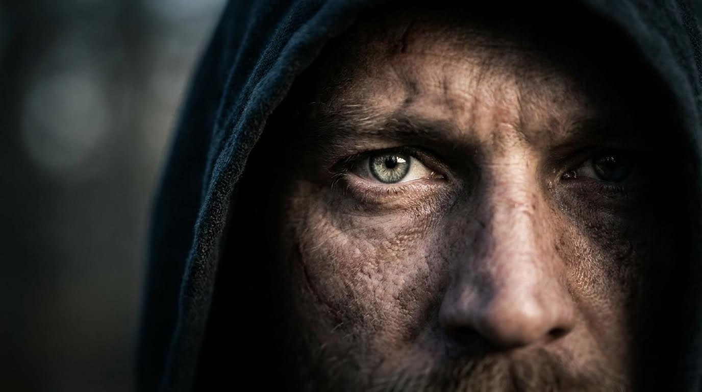
Best For: Character portraits, intimidation shots, emotional connection, headshots
Psychology: Direct eye contact in center creates powerful, unavoidable connection.
Chapter 2: Geometry & Lines
Using lines and shapes to guide the viewer's eye through the image.
Quick Reference: Line Types & Their Effects
Line Type | Emotional Effect | Common Uses |
|---|---|---|
Leading Lines | Direction, journey | Paths, roads, architecture |
Diagonal Lines | Energy, chaos | Action scenes, dutch angles |
Horizontal Lines | Calm, stability | Horizons, landscapes |
Vertical Lines | Power, height | Buildings, trees, authority |
S & C Curves | Grace, flow | Rivers, roads, natural paths |
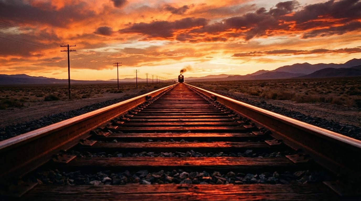
12. Leading Lines
How do leading lines improve composition?
Actual lines in the environment point directly to the subject, guiding the viewer's eye exactly where you want it.
The Prompt:
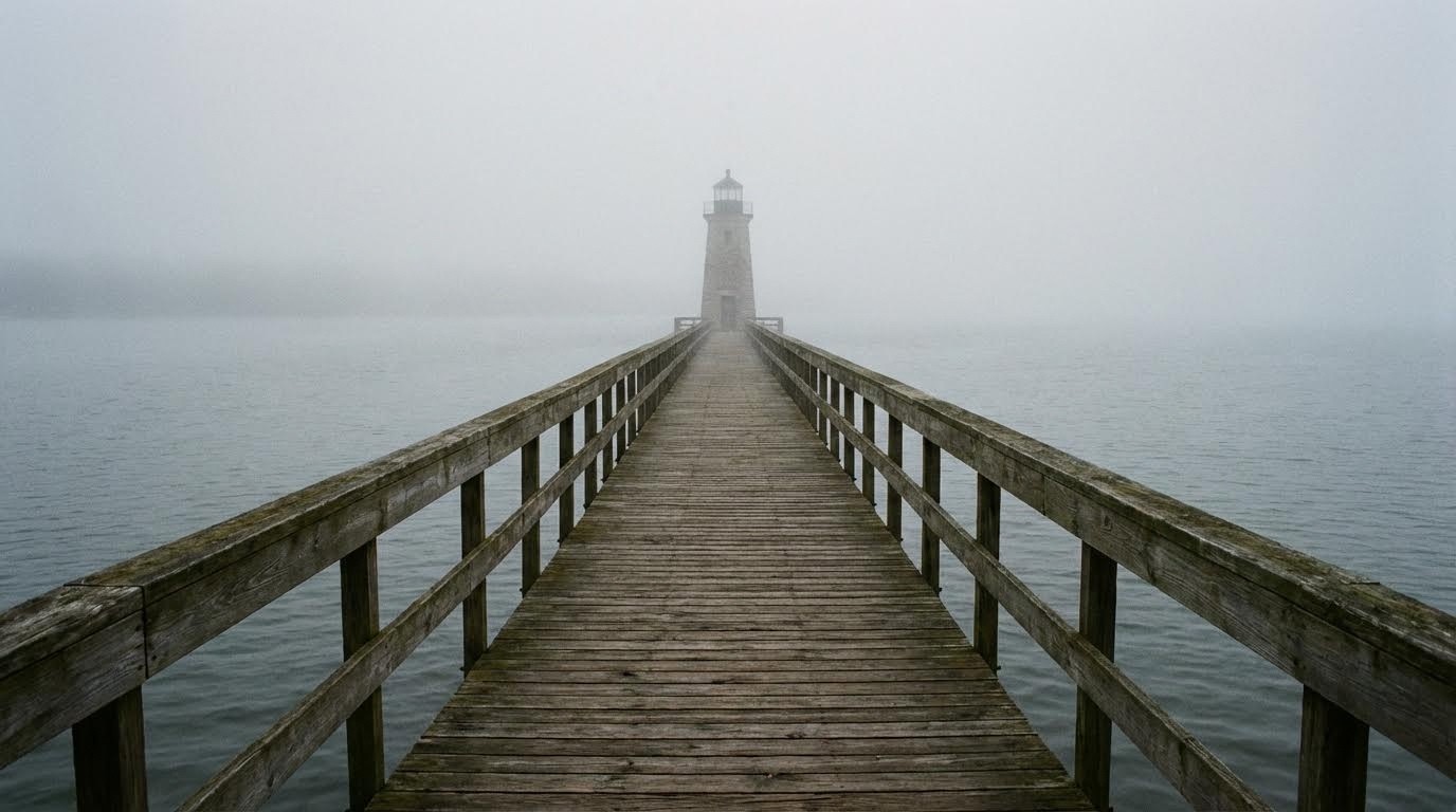
Best For: Landscape photography, architecture, roads, pathways, railways
Examples: Train tracks, roads, fences, bridges, hallways
13. Implied Lines
What are implied lines in photography?
Imaginary lines created by the gaze of subjects or the arrangement of objects. More subtle than physical lines.
The Prompt:
Best For: Group scenes, storytelling, directing attention, mystery
Power: Creates invisible geometry that guides without obvious visual elements.
14. Converging Lines
How do converging lines create depth?
Parallel lines that appear to meet in the distance create perspective depth and a sense of journey or infinity.
The Prompt:
Best For: Travel photography, perspective shots, depth emphasis, journey themes
Vanishing Point: The spot where parallel lines appear to meet.
15. Diagonal Lines
When should I use diagonal composition?
Angled lines create a sense of movement, speed, instability, or unrest. Common in action sequences.
The Prompt:
Best For: Action scenes, dynamic energy, chaos, instability, urban photography
Film Technique: "Dutch angle" or "canted angle" for psychological unease.
16. Horizontal Lines
What emotion do horizontal lines convey?
Lines running side-to-side create feelings of stability, calm, peace, and timelessness.
The Prompt:

Best For: Seascapes, landscapes, meditation imagery, peaceful scenes
Psychology: Mimics the stability of the horizon and sleeping position.
17. Vertical Lines
How do vertical lines affect perception?
Up-and-down lines convey power, height, strength, and growth. Common in architectural and authority imagery.
The Prompt:
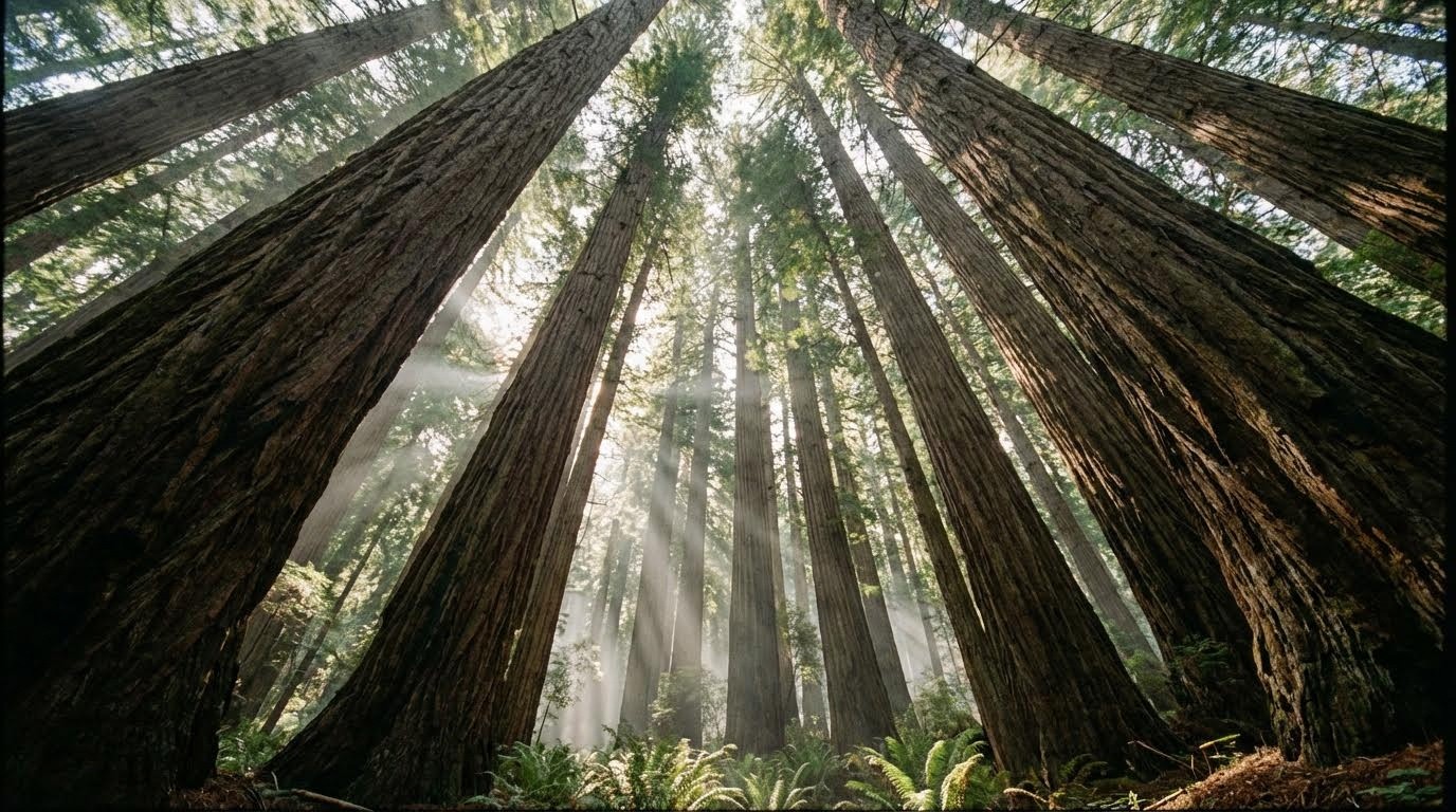
Best For: Architecture, forests, corporate imagery, authority, growth themes
Examples: Skyscrapers, trees, columns, standing figures
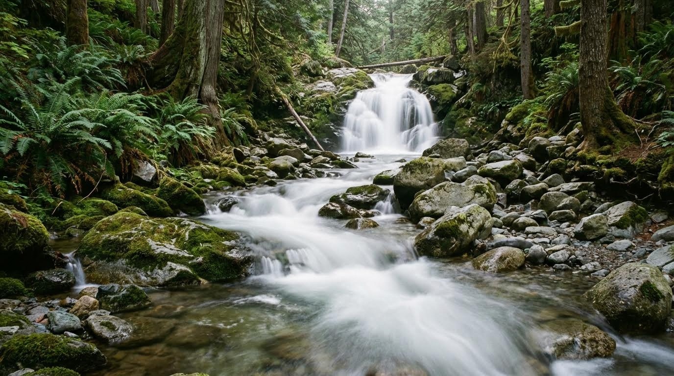
18. S & C Curves
What are S-curves in photography?
Winding lines that guide the eye gracefully through the image in a pleasing, natural flow.
The Prompt:
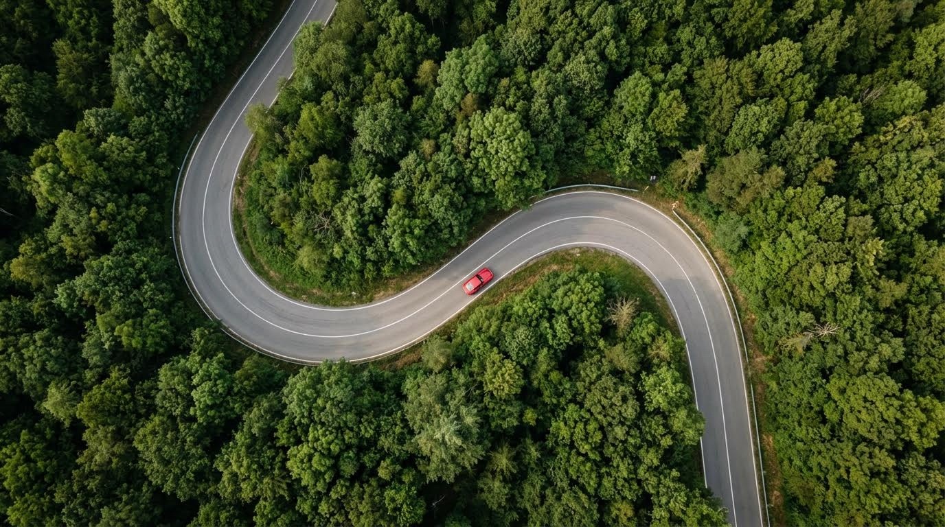
Best For: Roads, rivers, landscapes, natural paths, elegant flow
Classic Examples: River bends, serpentine roads, reclining figure poses
19. Geometric Shapes
How do I use geometric shapes in composition?
Use triangles, circles, or squares as the building blocks of your image structure for bold, graphic impact.
The Prompt:
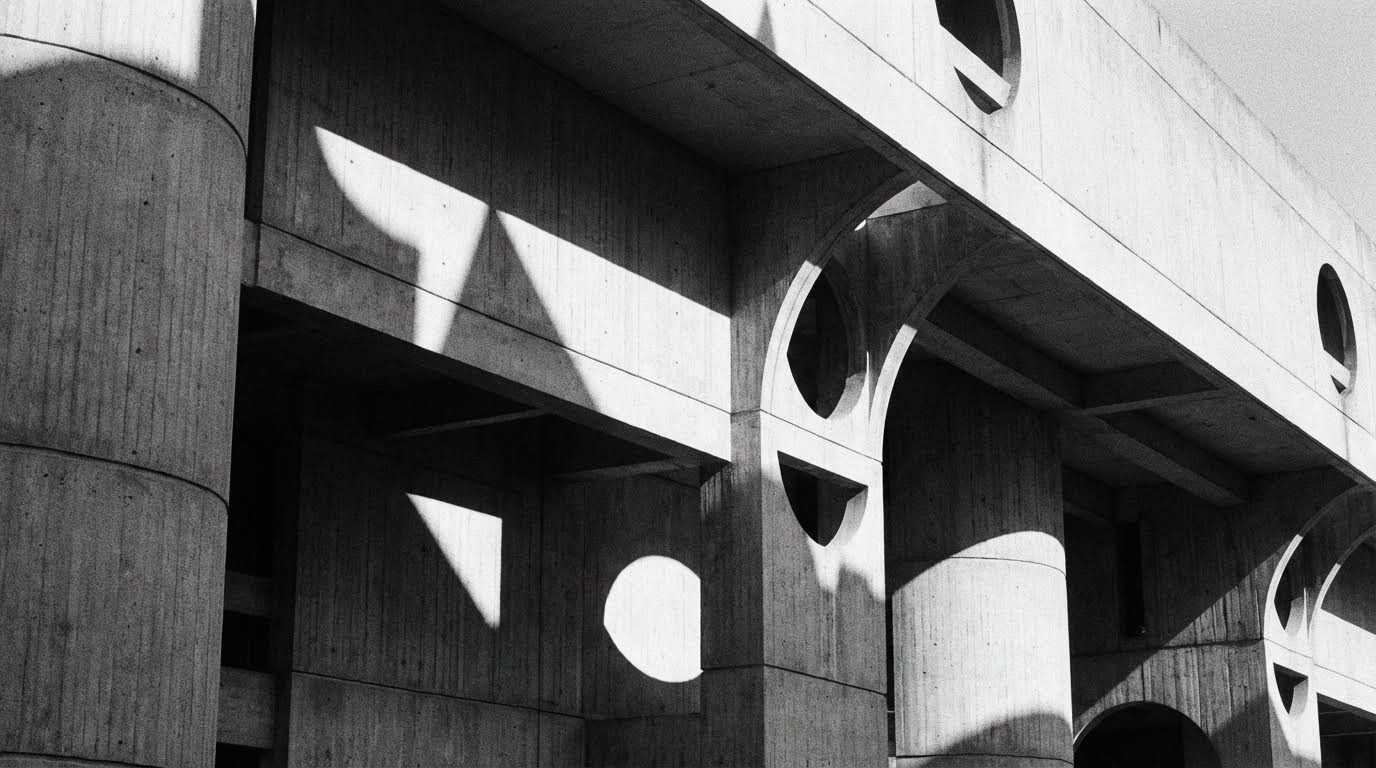
Best For: Architecture, abstract art, modern design, graphic imagery
Shapes & Meaning:
Triangles: Stability, direction, conflict
Circles: Unity, wholeness, infinity
Squares: Order, stability, confinement
Chapter 3: Perspective & Depth
Changing the camera position to alter psychological impact and spatial perception.
Quick Reference: Camera Angles & Psychology
Angle | Subject Appears | Viewer Feels |
|---|---|---|
Extreme Low | Powerful, dominant | Intimidated, small |
Low Angle | Strong, heroic | Impressed, respectful |
Eye Level | Equal, relatable | Connected, neutral |
High Angle | Vulnerable, weak | Superior, observing |
Extreme High (Bird's Eye) | Insignificant, isolated | Detached, god-like |
20. Point of View (High/Low Angles)
How do camera angles affect emotion in AI images?
Shooting from above conveys weakness or vulnerability. Shooting from below conveys power or heroism.
The Prompt:
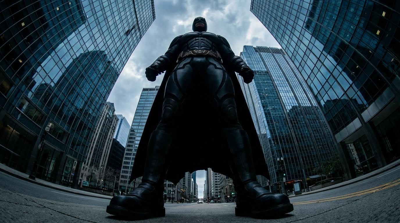
Best For: Character portraits, power dynamics, superhero shots, authority figures
Film Examples: Citizen Kane, superhero landings, villain introductions
21. Foreground, Middle Ground, Background
What is the three-layer depth technique?
Create distinct layers (foreground, middle, background) to build a 3D feel in a 2D image.
The Prompt:
Best For: Landscape photography, establishing shots, depth creation, scenic views
Technical: Use depth of field to separate layers—sharp middle, soft foreground/background.
22. Overlapping Elements
How does overlapping create depth perception?
Objects partially blocking each other show relative distance and create a sense of density and depth.
The Prompt:
Best For: Crowd scenes, markets, forests, complex environments, busy compositions
Principle: Our brain interprets overlap as "closer object blocks farther object."
23. Scale Contrast
How do I emphasize size in AI images?
Place a small subject next to a massive one to create dramatic scale emphasis and sense of awe.
The Prompt:
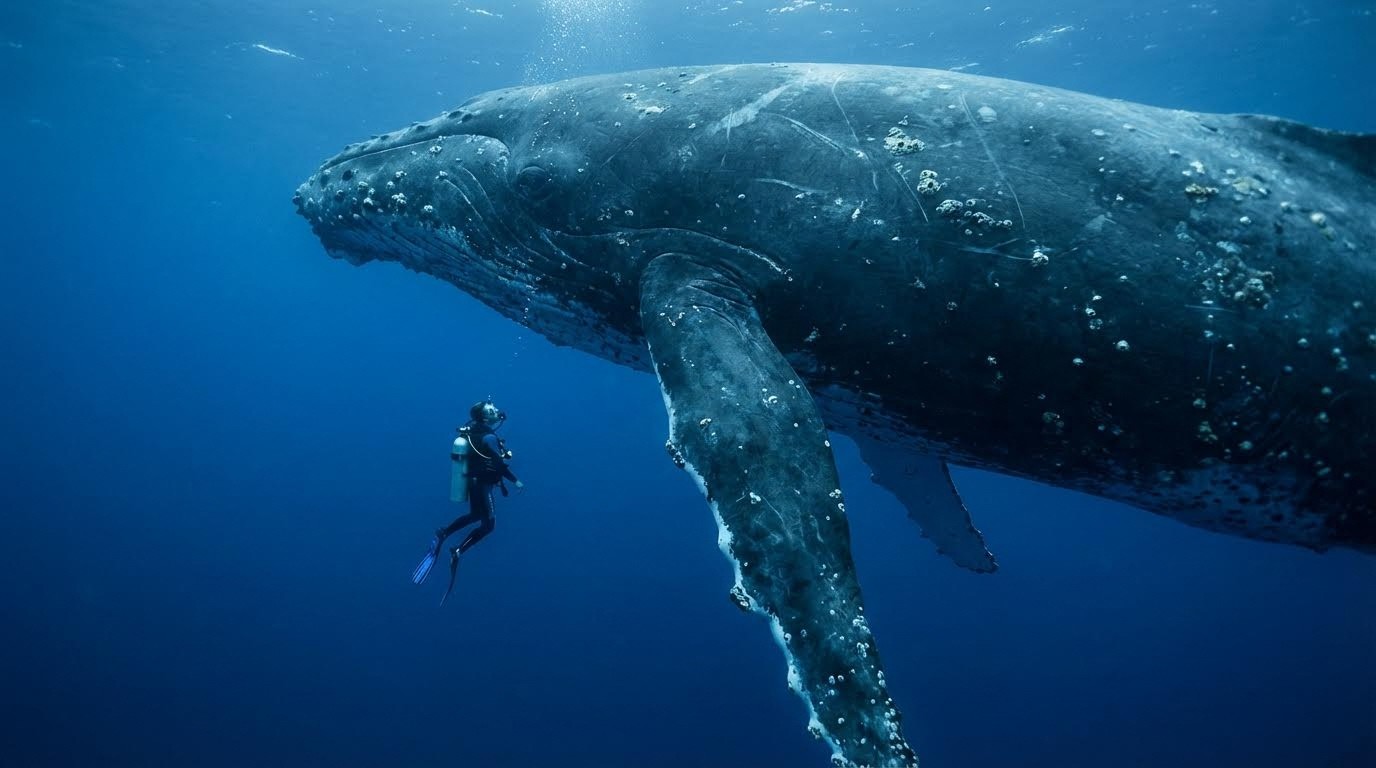
Best For: Nature photography, sci-fi scenes, emphasizing grandeur, creating wonder
Classic Examples: Person next to redwood, car next to mountain, diver next to whale
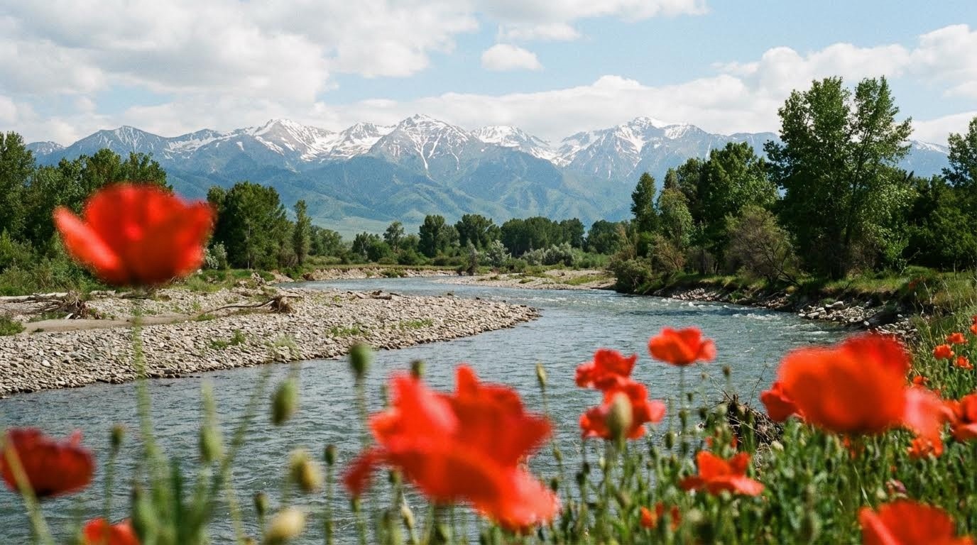
24. Leading Foreground Interest
What is foreground interest in landscape photography?
An interesting object at the bottom of the frame acts as a stepping stone that draws the eye into the scene.
The Prompt:
Best For: Landscape photography, architectural exteriors, nature scenes
Purpose: Prevents "empty" foreground and creates entry point for the viewer's eye.
Chapter 4: Balance & Visual Flow
Managing the visual weight, rhythm, and movement of the image.
25. Visual Balance
How do I balance visual weight in composition?
Balance visual "weight" across the frame—a dark, heavy object on one side balanced by a bright, detailed object on the other.
The Prompt:

Best For: Landscape photography, editorial design, creating equilibrium
Visual Weight Factors:
Size: Larger = heavier
Color: Darker = heavier
Complexity: More detail = heavier
Position: Bottom/edges = heavier
26. Repetition (Pattern)
When should I use repetitive patterns?
Repeating shapes or objects creates rhythm, order, and visual interest through consistent structure.
The Prompt:
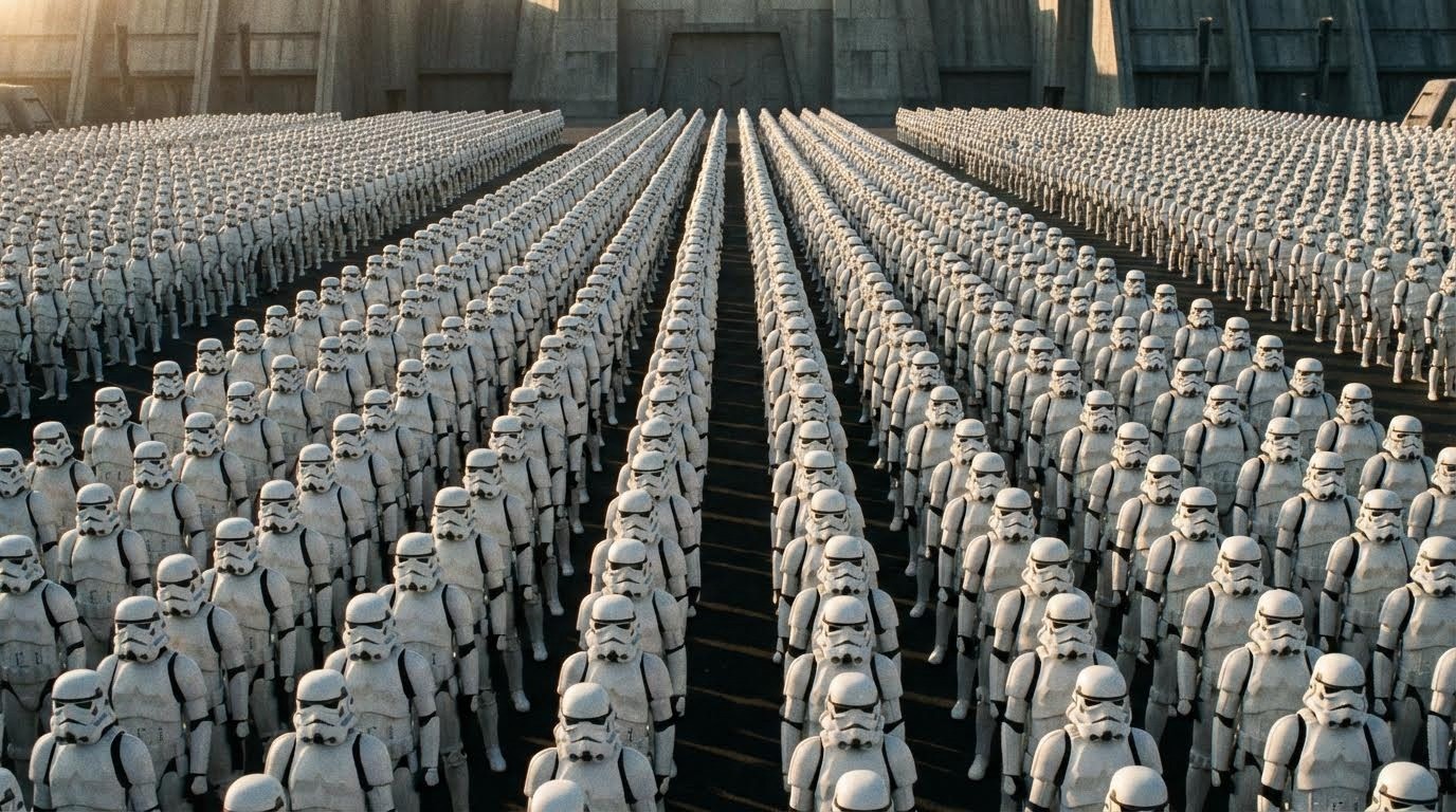
Best For: Architecture, industrial photography, minimalism, creating order
Examples: Windows on buildings, crowd formations, identical products, tessellations
27. Breaking the Pattern
How does breaking a pattern create a focal point?
Establish a repetitive pattern and then disrupt it with one anomaly to create an instant focal point.
The Prompt:
Best For: Concept art, storytelling, creating emphasis, "odd one out" themes
Psychology: Our brains are wired to notice breaks in patterns—instant attention.
28. Flow / Visual Path
What is visual flow in composition?
Create a clear "road map" for the eye to travel through the image in a deliberate sequence.
The Prompt:
Best For: Nature photography, storytelling, creating movement, guiding attention
Technique: Use lines, curves, and brightness to create a path the eye naturally follows.
29. Dynamic Tension
How do I create visual tension?
Lines moving in opposing directions or energy pushing outwards creates excitement and conflict.
The Prompt:
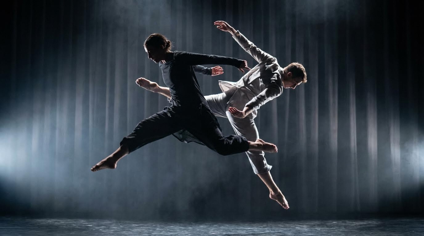
Best For: Sports photography, action scenes, conflict themes, energetic compositions
Effect: Creates visual "friction" that energizes the image.
Chapter 5: Lighting Techniques
Using illumination to define mood, shape, and atmosphere.
Quick Reference: Lighting Styles
Style | Mood | Best For |
|---|---|---|
Chiaroscuro | Dramatic, mysterious | Film noir, portraits |
High Key | Happy, ethereal, clean | Fashion, beauty, weddings |
Low Key | Moody, mysterious, intense | Thriller, drama, fine art |
Silhouette | Mysterious, romantic | Sunsets, minimalism |
30. Chiaroscuro
What is Chiaroscuro lighting?
Strong contrast between light and dark areas, made famous by Rembrandt and Caravaggio. Creates dramatic, three-dimensional effect.
The Prompt:
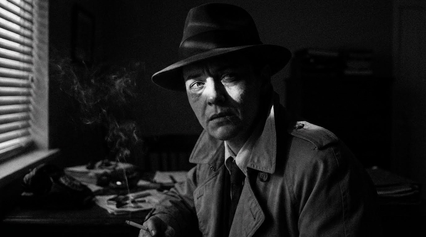
Best For: Film noir, dramatic portraits, mystery themes, classical art style
History: Italian for "light-dark" essential in Renaissance painting and modern cinematography.
31. High Key & Low Key Lighting
What's the difference between high key and low key photography?
High Key = bright, white, happy, minimal shadows
Low Key = dark, black, moody, maximum shadows
High Key Prompt:
Low Key Prompt:
Low key photography, silhouette of a boxer, dark background, rim lighting only, moody, mysterious.
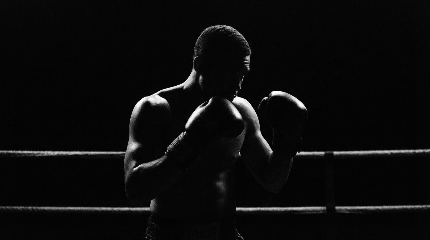
Best For:
High Key: Fashion, beauty, weddings, optimistic brands
Low Key: Thriller, luxury products, dramatic portraits, mystery
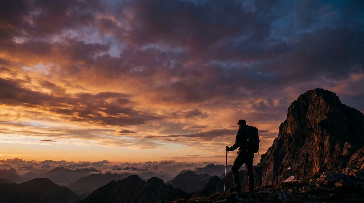
32. Silhouette
When should I use silhouette composition?
Backlight a subject so they appear as a solid black shape against a bright background. Creates mystery and iconic imagery.
The Prompt:
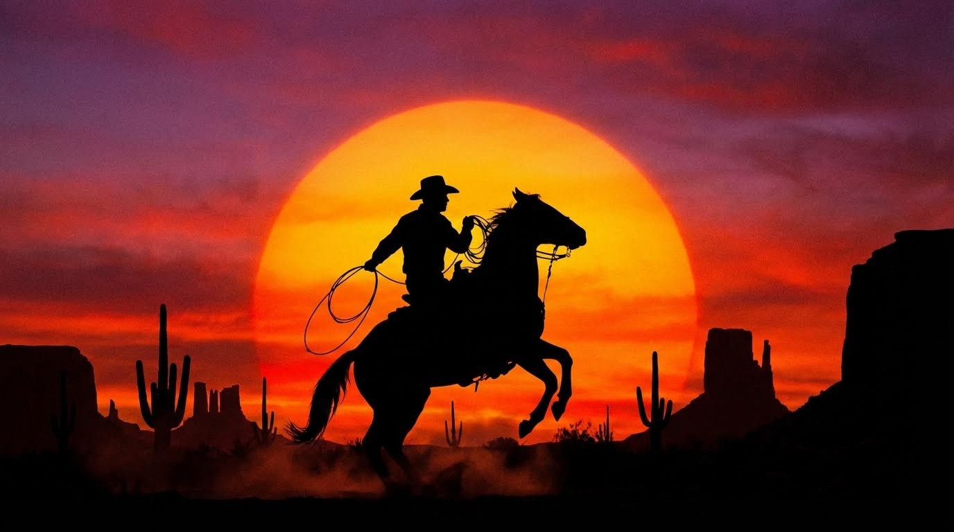
Best For: Sunsets, romantic scenes, iconic imagery, minimalist storytelling
Effect: Removes facial details, focusing on shape, posture, and outline.
Chapter 6: Color Theory
Using color psychology to evoke specific emotions and create visual harmony.
Quick Reference: Color Psychology
Color | Emotion | Common Uses |
|---|---|---|
Red | Passion, danger, energy | Action, romance, warnings |
Blue | Trust, calm, sadness | Corporate, healthcare, water |
Yellow | Happiness, caution | Optimism, children, warnings |
Green | Nature, growth, wealth | Eco brands, health, finance |
Orange | Enthusiasm, warmth | Energy, food, creativity |
Purple | Luxury, mystery, spirituality | Premium brands, fantasy |
33. Complementary Colors
What are complementary colors in photography?
Opposite colors on the color wheel (Teal/Orange, Red/Green, Purple/Yellow) create maximum contrast and visual pop.
The Prompt:
Best For: Cinematic looks, eye-catching imagery, modern photography, vibrant scenes
Hollywood Secret: Teal & Orange is THE most used color grade in blockbuster films.
34. Analogous Colors
When should I use analogous color schemes?
Colors next to each other on the wheel (Green/Blue/Teal or Red/Orange/Yellow) create harmony and cohesion.
The Prompt:
Best For: Nature photography, peaceful scenes, cohesive branding, serene atmospheres
Effect: Creates unity and reduces visual conflict easier on the eyes.
35. Triadic Colors
What is a triadic color scheme?
Three colors evenly spaced on the color wheel (Red/Yellow/Blue or Orange/Green/Purple) creates vibrant, balanced energy.
The Prompt:
Best For: Children's content, playful imagery, pop art, energetic compositions
Balance: Each color gets equal visual weight no single color dominates.
36. Warm vs. Cool Colors
How do I use color temperature contrast?
Contrast warm colors (reds, oranges, yellows) against cool colors (blues, teals, purples) to create emotional temperature contrast.
The Prompt:

Best For: Creating atmosphere, emotional contrast, fire and ice themes, dramatic scenes
Psychology:
Warm colors = comfort, energy, danger
Cool colors = calm, sadness, distance
37. Color Dominance
When should one color dominate the entire image?
Let one specific color take over 60-80% of the frame to create strong mood and emotional resonance.
The Prompt:
Best For: Emotional storytelling, brand photography, mood creation, artistic expression
Film Examples: Her (red/orange), The Matrix (green), Blade Runner 2049 (orange/purple)
38. Monochrome Composition
What is monochromatic color composition?
Use only shades, tints, and tones of a single color to create cohesive, sophisticated imagery.
The Prompt:
Best For: Artistic photography, emotional depth, sophisticated branding, film noir
Not the same as: Black and white (which is achromatic, not monochromatic)
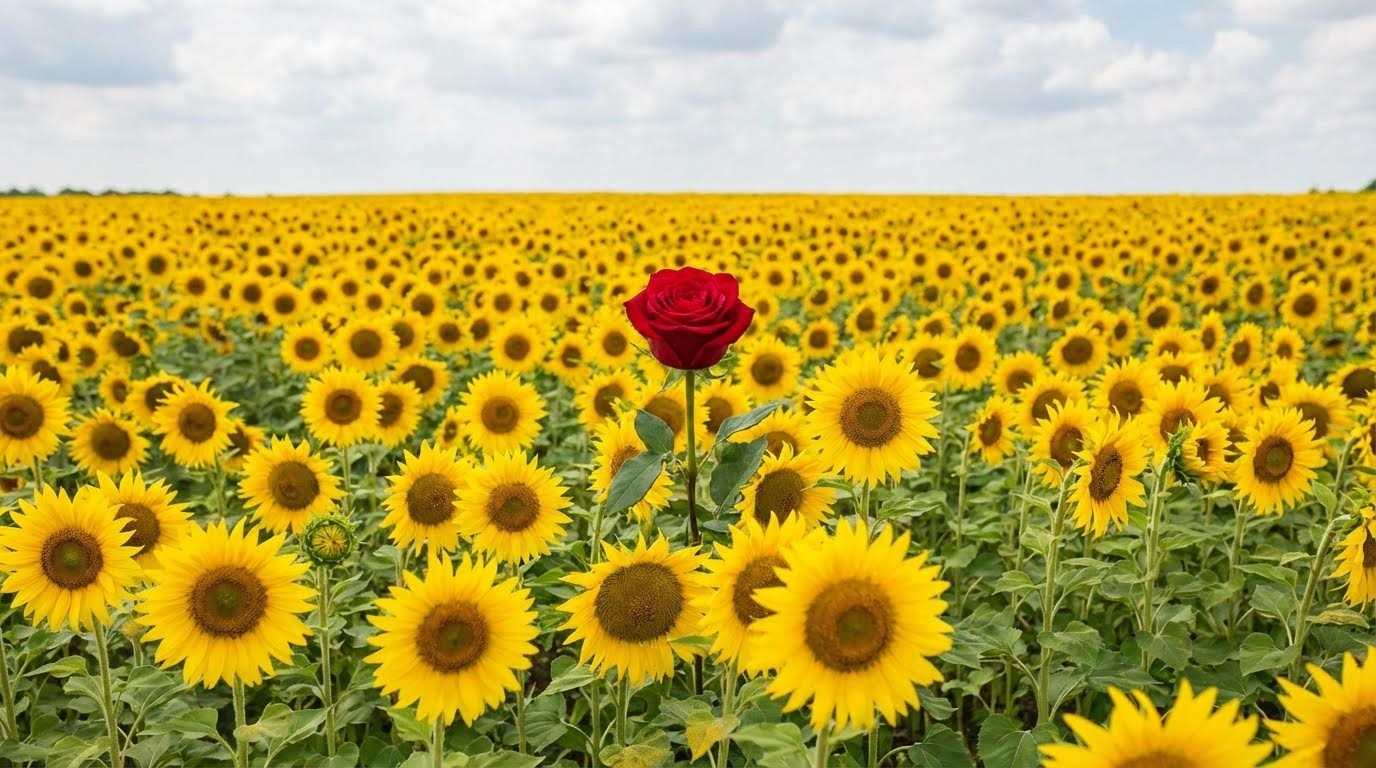
39. Pop of Color
How do I use selective color effectively?
A black and white (or desaturated) image with one brightly colored object creates instant focal point.
The Prompt:
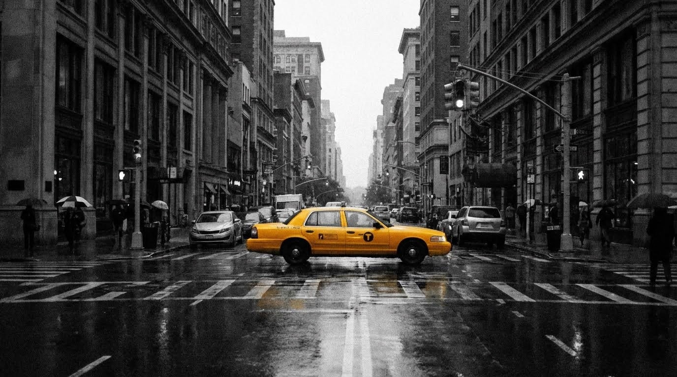
Best For: Creating focal points, artistic expression, emphasizing key objects, advertising
Classic Example: The girl in the red coat from Schindler's List
Chapter 7: Subject Relationship & Storytelling
Telling visual stories through the arrangement and relationship of elements.
40. Juxtaposition
What is juxtaposition in visual storytelling?
Place conflicting or contrasting concepts side-by-side to create meaning, irony, or commentary.
The Prompt:
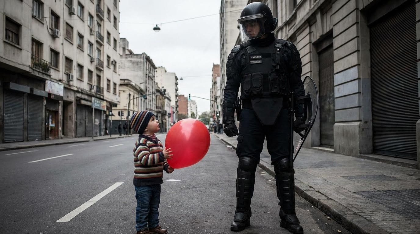
Best For: Social commentary, conceptual art, editorial photography, thought-provoking imagery
Examples:
War & Peace
Rich & Poor
Old & New
Nature & Industry
41. Storytelling Composition
How do I create narrative with composition?
Arrange visual clues in the frame that imply a narrative or suggest what happened before/after.
The Prompt:
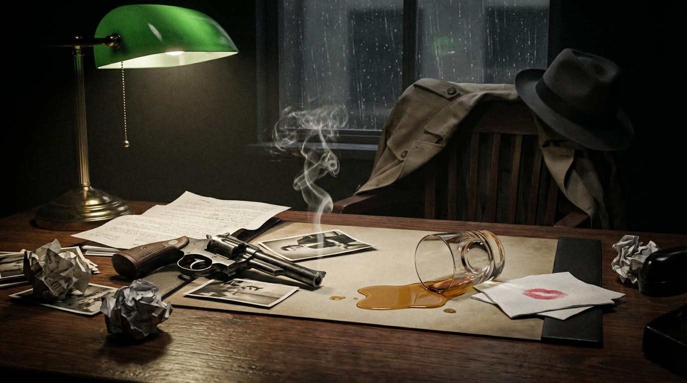
Best For: Editorial photography, film stills, conceptual art, mystery themes
Technique: Include props, environmental details, and suggestive elements that tell a story without words.
42. Minimalism
When should I use minimalist composition?
Strip away everything but the essential subject. Less is more. Simplicity creates impact.
The Prompt:
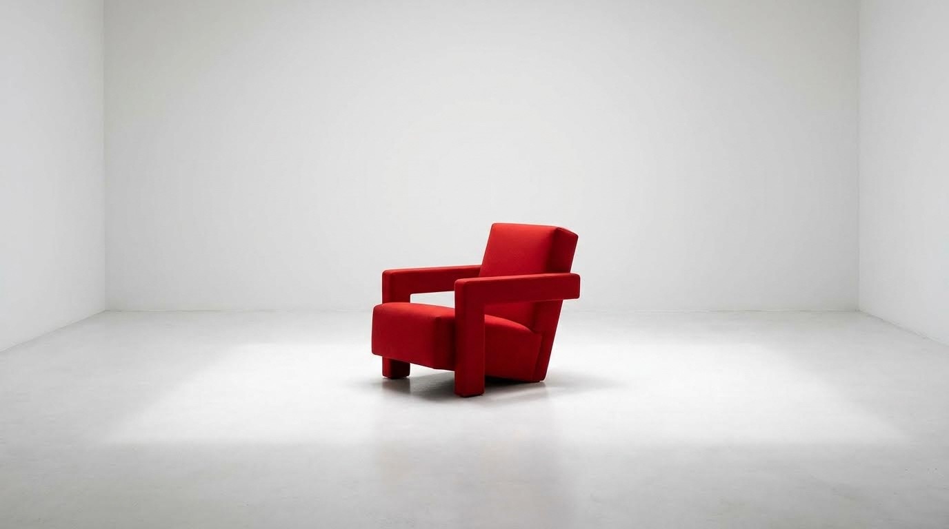
Best For: Product photography, Apple-style branding, modern art, creating calm
Philosophy: "Perfection is achieved not when there is nothing more to add, but when there is nothing left to take away." Antoine de Saint-Exupéry
Combining Techniques for Maximum Impact
The real magic happens when you combine multiple composition techniques in a single image.
Powerful Combinations
Cinematic Portrait:
Epic Landscape:
Urban Storytelling:
Minimalist Product:
Common Composition Mistakes to Avoid
Mistake #1: Centering Everything
❌ Wrong: Placing every subject dead center
✅ Right: Use rule of thirds, golden ratio, or asymmetry
Why: Centered subjects feel static and amateur unless intentionally symmetrical.
Mistake #2: Ignoring the Background
❌ Wrong: "A portrait of a woman" (AI adds random background)
✅ Right: "A portrait of a woman, clean minimalist white background, no distractions"
Why: Background elements compete for attention and ruin composition.
Mistake #3: No Clear Focal Point
❌ Wrong: Everything in the frame has equal visual weight
✅ Right: Use breaking the pattern, pop of color, or depth of field to create hierarchy
Why: The eye needs somewhere to land first.
Mistake #4: Overcomplicating
❌ Wrong: Trying to use 10 techniques in one image
✅ Right: Choose 2-3 complementary techniques
Why: Too many competing techniques create chaos, not art.
Frequently Asked Questions
What composition technique should I start with?
Start with the Rule of Thirds, it's the most versatile and works for 80% of images. Once comfortable, add complementary colors and leading lines to your repertoire.
Can I combine multiple composition techniques?
Absolutely! Professional images often use 3-5 techniques simultaneously. For example: Rule of thirds + complementary colors + leading lines + foreground interest = cinematic landscape.
Which composition creates the most dramatic effect?
Chiaroscuro lighting combined with low angle perspective and complementary colors creates maximum drama. Think film noir meets superhero cinematography.
How do I choose the right composition for my project?
Match composition to your goal:
Marketing: Rule of thirds, high key, complementary colors
Storytelling: Juxtaposition, framing within frame, visual path
Drama: Chiaroscuro, low angle, dynamic tension
Minimalism: Negative space, monochrome, simplicity
What's the difference between composition and framing?
Framing is how you place subjects within the canvas (rule of thirds, symmetry). Composition includes framing + lighting + color + perspective, the complete visual arrangement.
Do these techniques work with other AI tools?
Yes! These composition principles are universal. While prompts are optimized for Atlabs AI, you can adapt them for Midjourney, DALL-E, Stable Diffusion, or any text-to-image platform.
Quick Reference: Composition Cheat Sheet
By Mood
Dramatic: Chiaroscuro + Low Angle + Complementary Colors
Peaceful: Horizontal Lines + Analogous Colors + High Key
Energetic: Diagonal Lines + Triadic Colors + Dynamic Tension
Mysterious: Silhouette + Negative Space + Low Key
Professional: Rule of Thirds + Visual Balance + Monochrome
Epic: Leading Lines + Scale Contrast + Warm vs Cool
By Subject
Portraits: Rule of Thirds, Center Eye Dominance, Chiaroscuro
Landscapes: Golden Ratio, Leading Lines, Foreground Interest
Products: Minimalism, Negative Space, High Key, Symmetry
Architecture: Symmetry, Vertical Lines, Geometric Shapes
Action: Diagonal Lines, Dynamic Tension, Low Angle
Conceptual: Juxtaposition, Breaking Pattern, Storytelling
Create Your Cinematic Masterpiece on Atlabs AI
Now that you have the visual vocabulary of a professional director and cinematographer, you can transform simple prompts into complex visual stories.
What Makes Atlabs AI Perfect for Composition
✓ 50+ AI models in one platform for maximum creative control
✓ Consistent results with advanced prompt understanding
✓ Professional-grade outputs ready for commercial use
✓ All composition techniques work seamlessly with our models
✓ No context switching generate, edit, and refine in one workspace
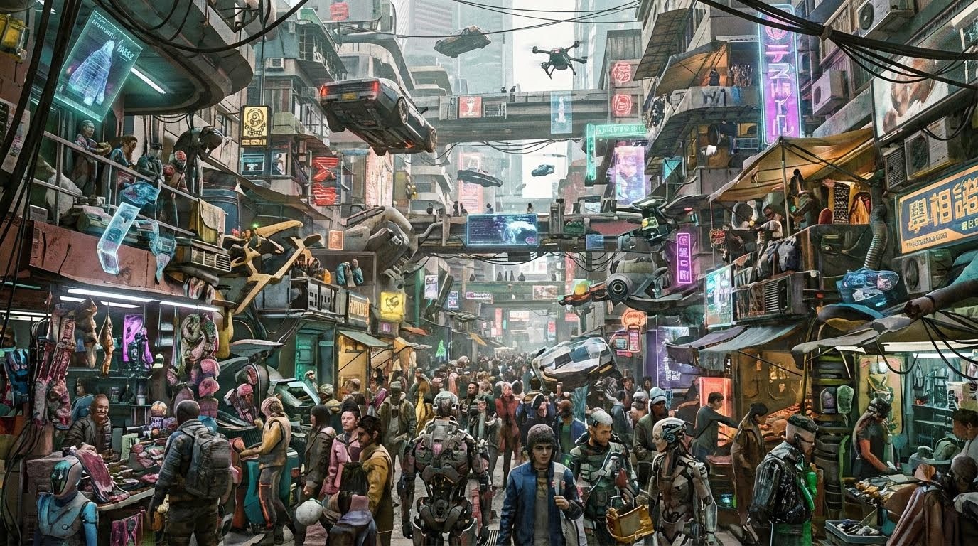
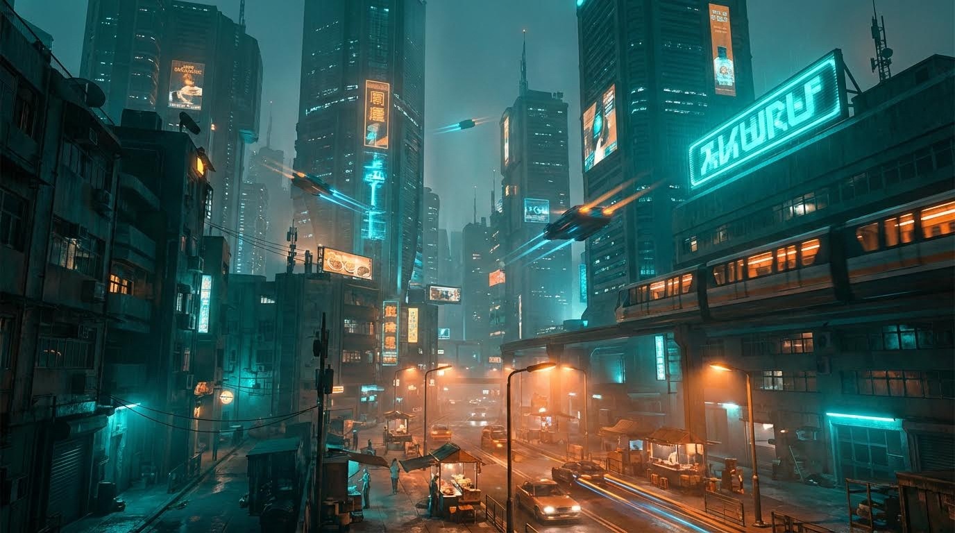
Ready to create? Try combining techniques like "Cyberpunk city with leading lines, complementary teal and orange colors, and Chiaroscuro lighting" to see how Atlabs AI interprets professional composition rules.
Start Creating on Atlabs AI – Free Trial Available
Related Guides
Prompt Guide for AI Film Dialogue Scenes using 180 Degree Rule
How to Turn One Image into Multiple Camera Angles with Nano Banana Pro
Tags: AI image composition, cinematic AI prompts, photography techniques, Atlabs AI, rule of thirds, golden ratio, Chiaroscuro lighting, color theory, visual storytelling, AI art prompts, composition techniques, cinematography
Pro Tips Summary
💡 Start simple: Master 3-5 core techniques before combining
💡 Study films: Watch how cinematographers use these techniques
💡 Reference real photos: Analyze professional photography composition
💡 Save your best prompts: Build a personal prompt library
💡 Iterate quickly: Generate multiple versions with slight variations
💡 Learn the rules to break them: Once you master fundamentals, experiment
Master composition. Direct AI like a pro. Create art that matters.